
Fonts might seem important to the viewing eye but it has such an positive impact on the movie industry. Also it sends a message of what type of movie genre the movie will be about.
There are basically two types of font :

Such as Times and Garmond. It suggests about:
- old
- classical
- formal
- traditional
- old fashioned
- higher class

Such as Optima and Comic Sans. It is :
- comical
- modern
- friendly
- childlike
- informal
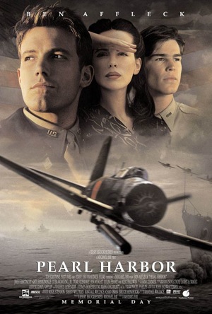
In PEARL HARBOUR, the font being used is Palatino it is Serif Font. It is all in white colour and in capital letter. It might have references to a soldier in the row. Also the military clothing is very well organised as the letters are. As the soldiers are in their uniform, the title represents an order of neatness as the letters of the title are all in the same length in height.

In Rocky, the font being used is Franklin Gothic Heavy it is Sans Serif. It's big and bold and easy to read. It tells that the character is not a traditional person. Rocky is not educated. He is simple, but hard working. The title suggests that Rocky is Brave, strong and paunchy. The woman next to him, tell the audience that he has two sides. In the middle, he is soft, kind and carry. As Rocky is uneducated they decided to go with an font that is simple and easy to read, this also fits in to Rocky's mind type. As Rocky is of the lower class and Sans Serif is more of the lower class typr, that's why Franklin Gothic Heavy was used for the poster.
No comments:
Post a Comment